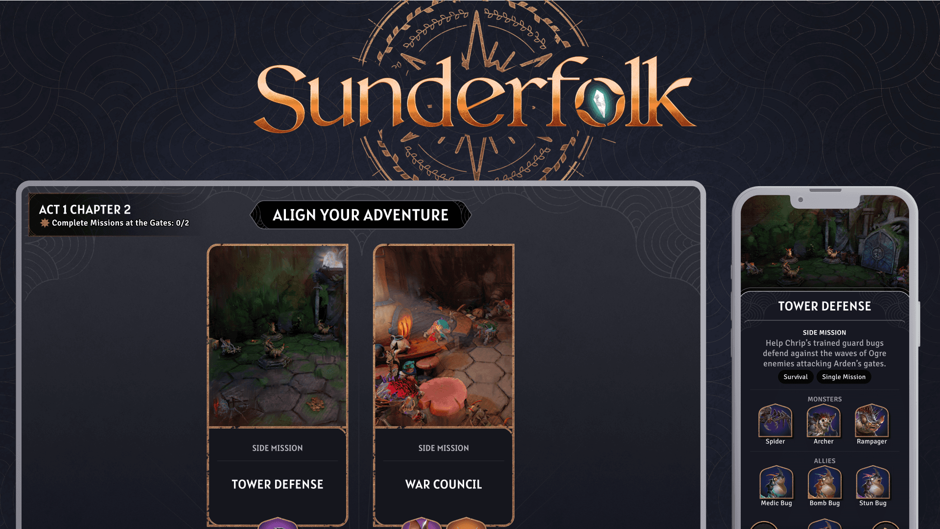
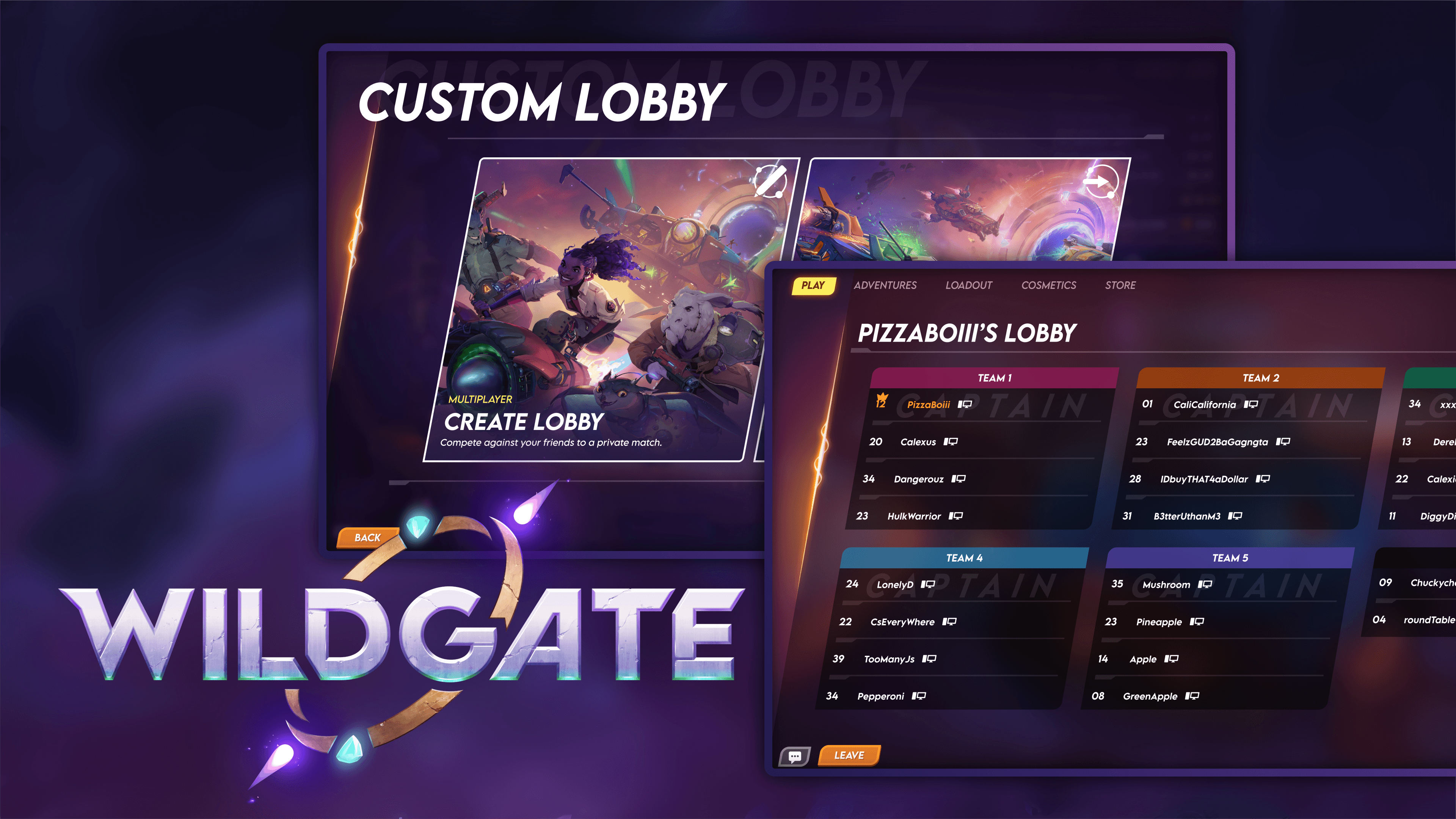
From Sunderfolk to Shadowstone
On Shadowstone, I've had the opportunity to own the UX/UI across different stages of development, working closely with designers, artists, and engineers to bring ideas from early concepts into the game.
In this case study, I'll walk through the evolution of Shadowstone's combat experience—from its Sunderfolk roots to a PC-first interface—and how continuous iteration and QoL improvements shaped the final experience.
Role
UX/UI Designer
Feature
Owner
Steam
Tools
Figma, Unity, Adobe Creative Suites
Problem
How do we preserve the clarity of Sunderfolk's shared-screen experience while creating Shadowstone's faster PC combat experience?
Research
Competitive Analysis
Understanding the spaces players need
I looked at how strategy and deck-building games such as TFT, Slay the Spire 2, and Root organize information and player interactions.


Key Takeaway
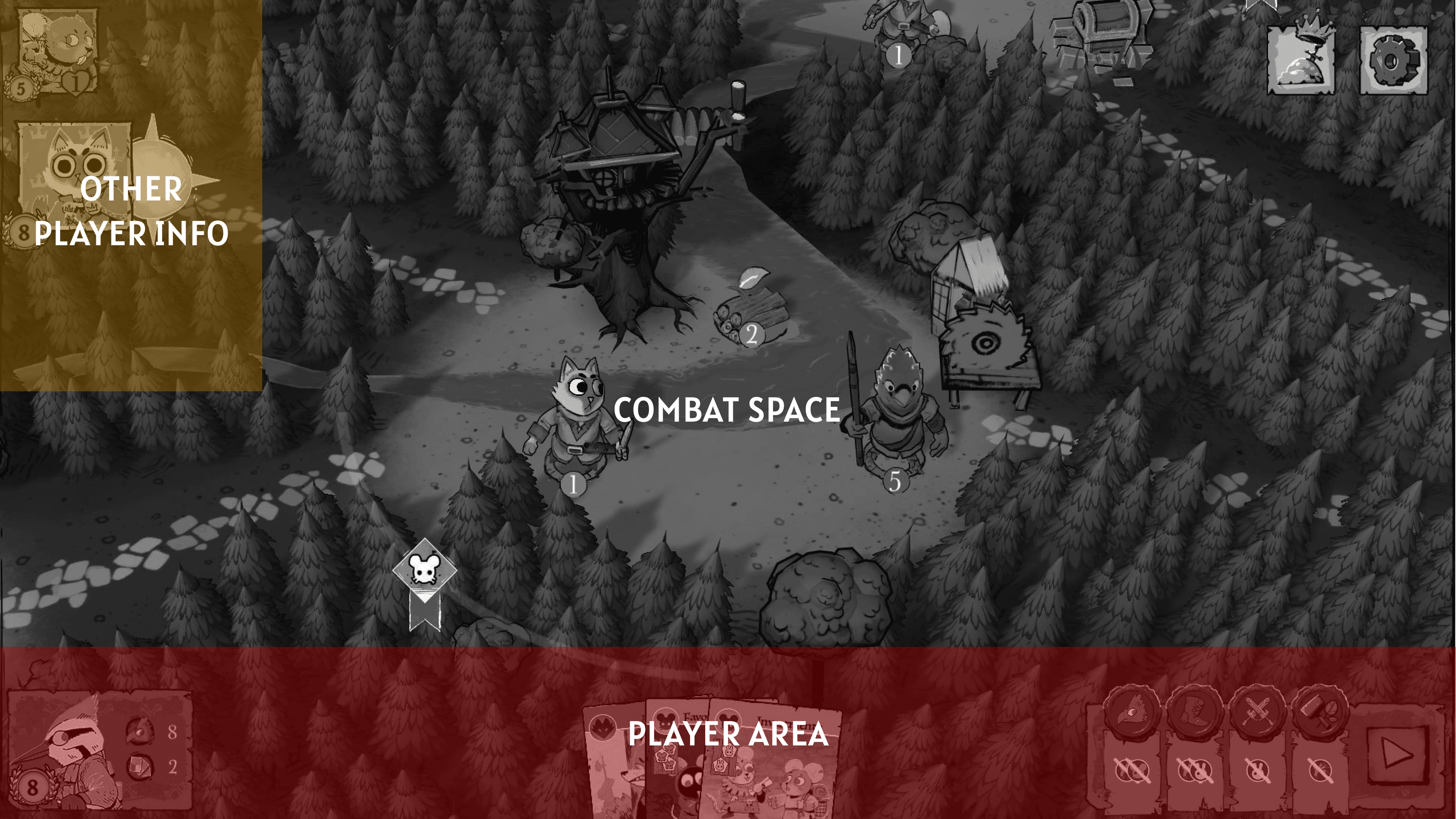
Players need a clear distinction between what they are playing on and what they are planning with.
Guiding Principles
Play Space
Understand the current state of combat.
Planning Space
Make decisions, inspect information, and prepare actions.
Design
Snappier Gameplay
I focused on designing around the player's attention, starting by intentionally creating free space within the interface. This allowed the UI to breathe while making important elements easier to identify.

Gameplay flow
I mapped the most common gameplay actions and looked for unnecessary movement between them.

Concepts:
My first concept focused on these things:
Creating Space
Removing Unnecessary Steps
Accessible Information
Designing for Growth


Testing
The design wasn't finished when the mockup was.
A major part of the process was testing these changes in actual gameplay. Playtesting exposed problems that weren't always obvious in static designs.
Center Hub
Reorganized its centered visual dominance so it wouldn't compete with the primary gameplay space.


Spell Actions
Increased emphasis and clarity around available actions with color coded highlighting.
Inspect Hubs + Tooltips
Added detailed information out of the primary UI while keeping it easily accessible. Allowed players to keep important information visible when they needed it.

Solution
Solo vs Party
Engaging experiences that remain informative and clear for all players.
Accessible Information
10% Main screen & 90% Personal screen
Align & Ready-Up
Players gather at the center of the gates to vote on their choices collectively.
Shadowstone's combat experience continues to evolve through player feedback, playtesting, and iteration. Each round of feedback helps us identify what can be clearer, faster, or more intuitive, from small improvements to larger changes in layout and interaction flow.
See more