
From Sunderfolk to Shadowstone
On Shadowstone, I've had the opportunity to own the UX/UI across different stages of development, working closely with designers, artists, and engineers to bring ideas from early concepts into the game.
In this case study, I'll walk through the evolution of Shadowstone's combat experience—from its Sunderfolk roots to a PC-first interface—and how continuous iteration and QoL improvements shaped the final experience.
Role
UX/UI Designer
Feature
Owner
Timeline
Live Service
Tools
Figma, Unity, Adobe Creative Suites
From a shared screen to a personal play space
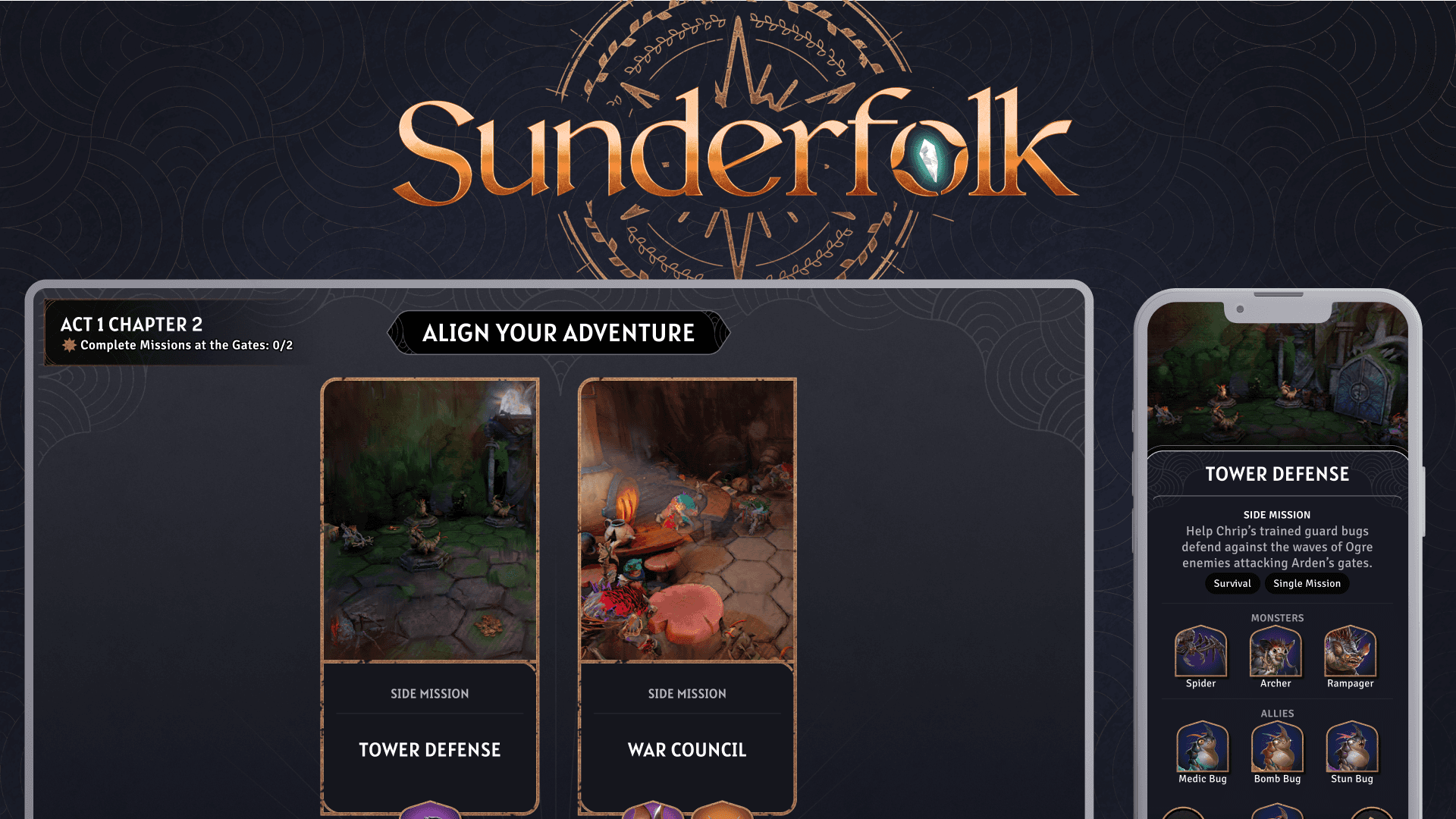
Shadowstone's combat experience grew from Sunderfolk's unique two-screen paradigm: a shared main screen for the battle and personal phones for actions and planning.
As Shadowstone shifted to PC, we needed to rethink how these two spaces could work together on a single screen.
Problem
How do we preserve the clarity of Sunderfolk's shared-screen experience while creating Shadowstone's faster PC combat experience?
Research
Competitive Analysis
Understanding the spaces players need
I looked at how strategy and deck-building games such as TFT, Slay the Spire 2, and Root organize information and player interactions.


Key Takeaway
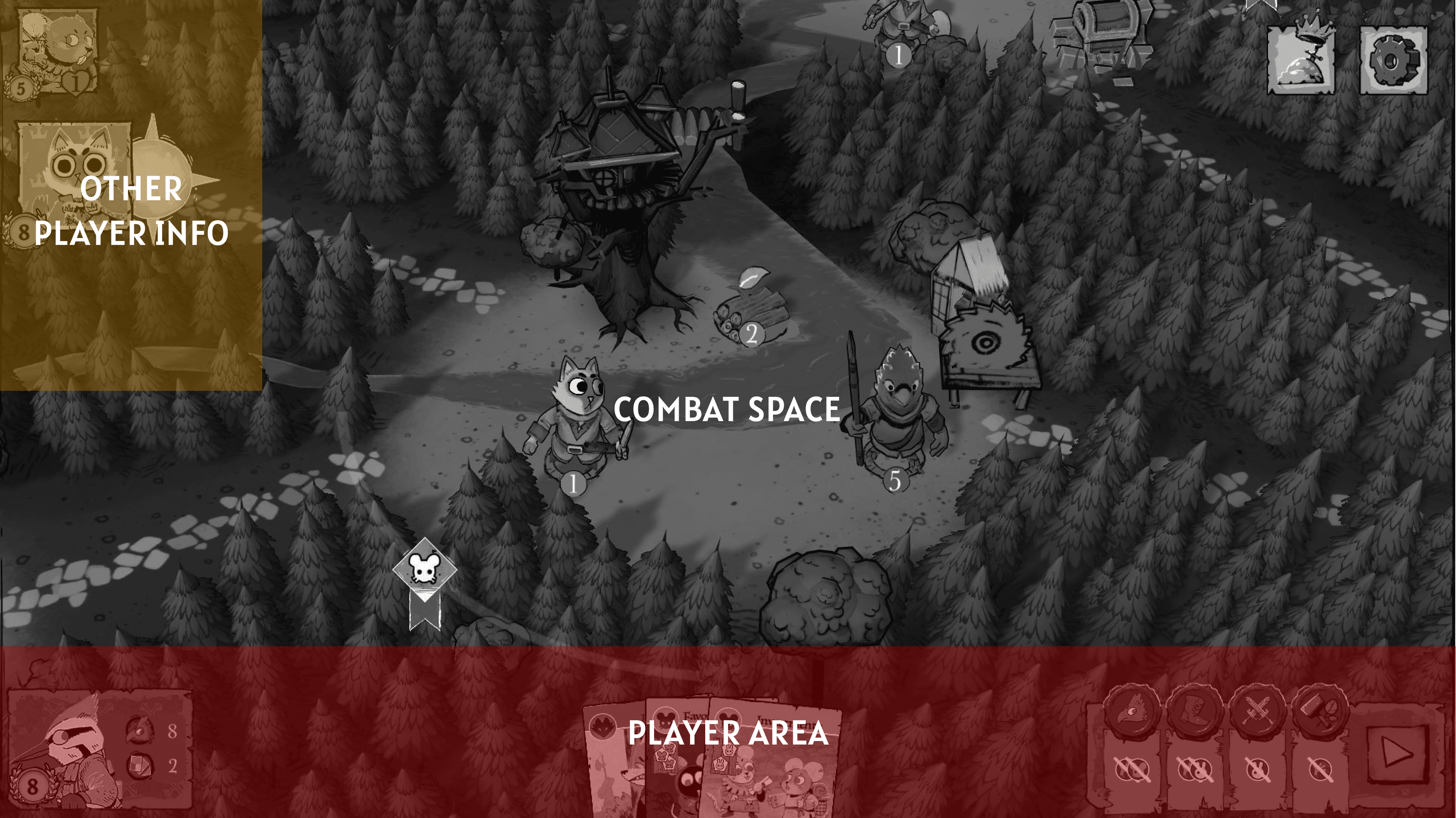
Players need a clear distinction between what they are playing on and what they are planning with.
Starting Layout
Sunderfolk organized information through the main screen and phone.

Guiding Principles
Play Space
Understand the current state of combat.
Planning Space
Make decisions, inspect information, and prepare actions.
Design
Rebuilding the combat layout
The biggest shift was moving away from treating the original Sunderfolk layout as something that needed to be preserved.
Note: In Sunderfolk 2.0, online multiplayer had shared elements to allow flexibility of keyboard+mouse and mainscreen+phone.


What should combat feel like when the player has the entire screen?
Concept
Snappier Gameplay
I focused on designing around the player's attention.
One of the biggest improvements came from intentionally creating free space within the interface. This allowed the UI to breathe while making important elements easier to identify.

Gameplay flow
I mapped the most common gameplay actions and looked for unnecessary movement between them.
Lofi Wireframes
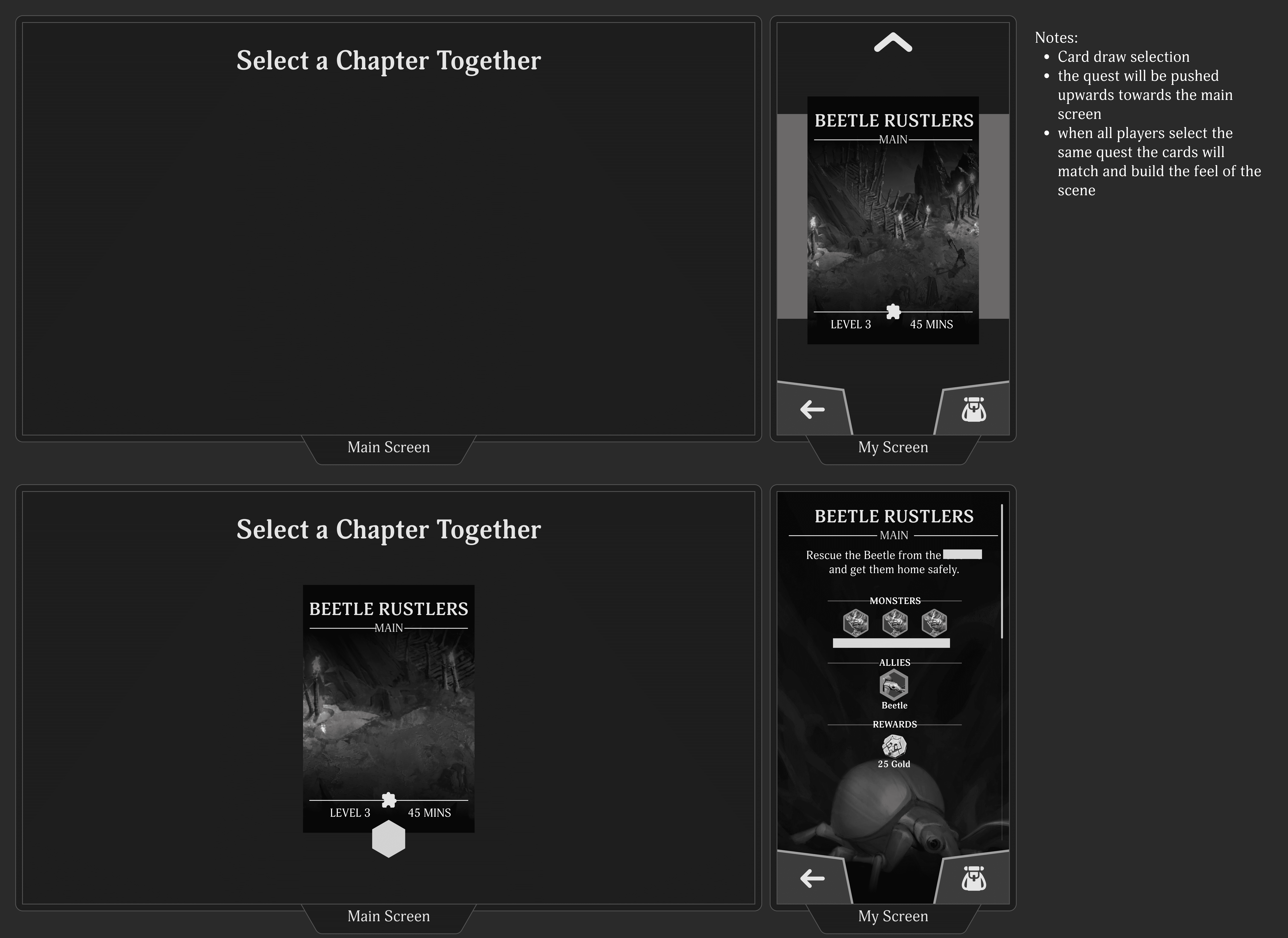
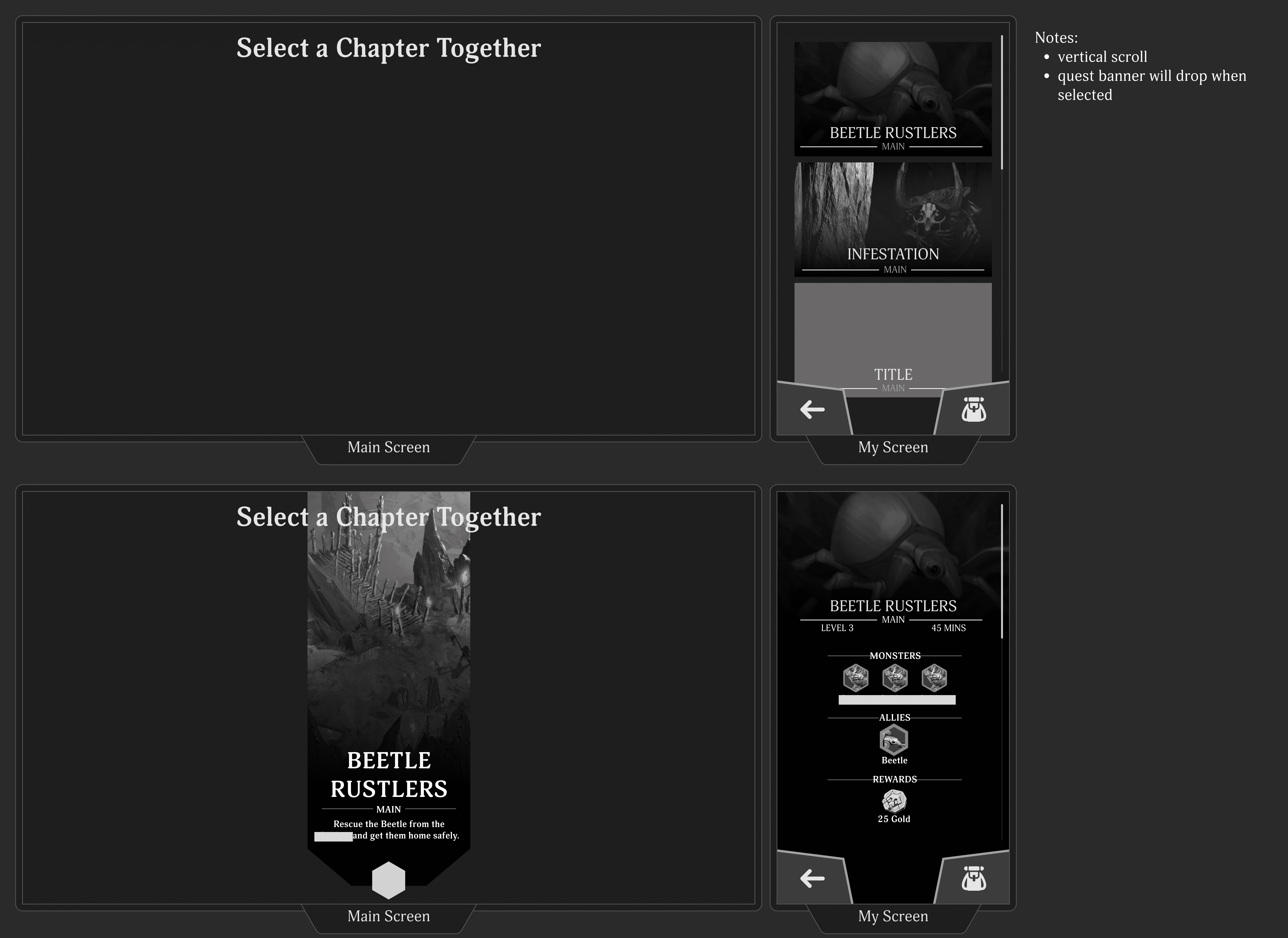
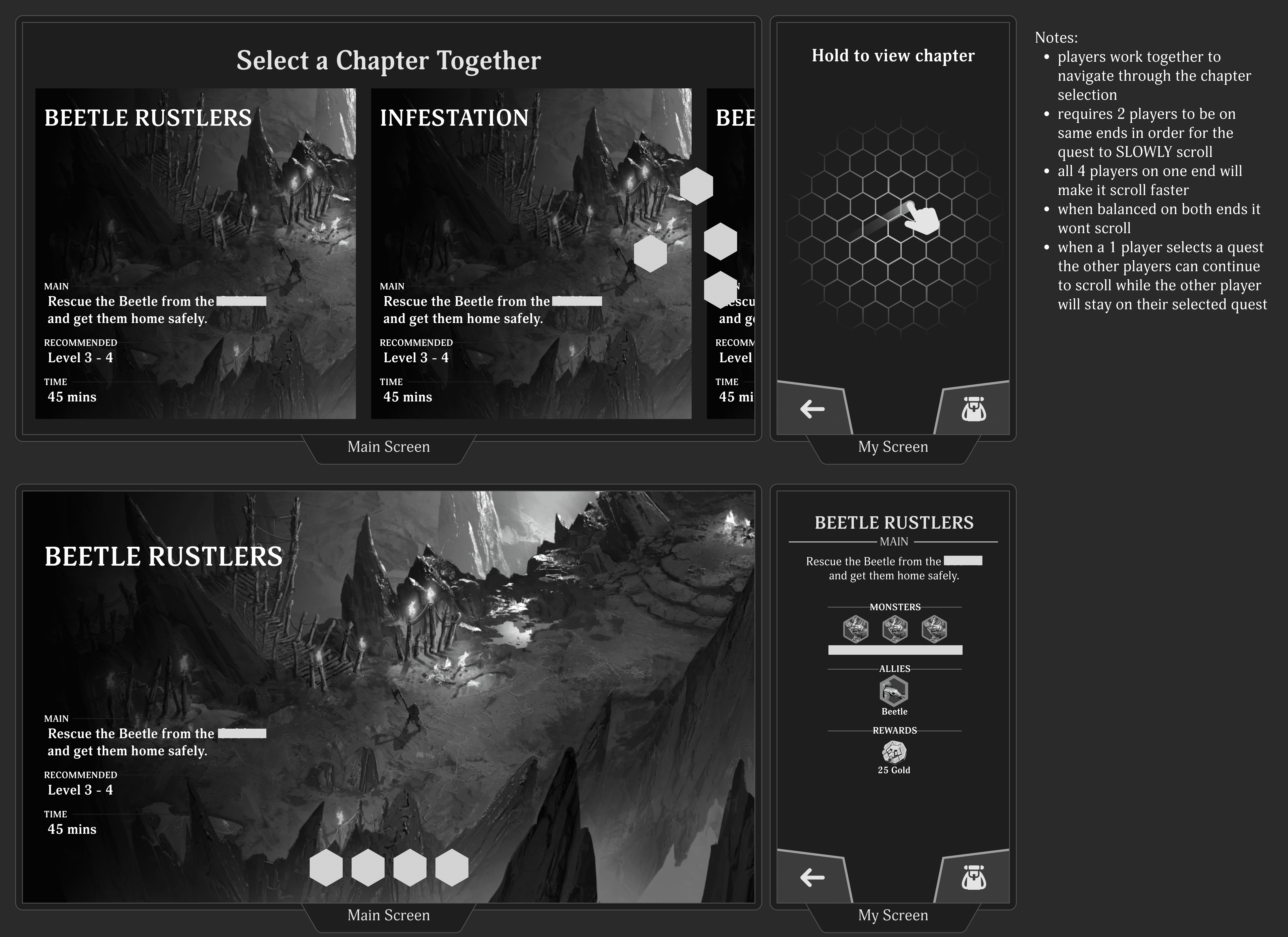
With a clear understanding of layout organization, I moved forward with the visual design of the main and personal screens. I focused on making information digestible and intuitive through thoughtful use of 2D art, iconography, and labeling.
Testing
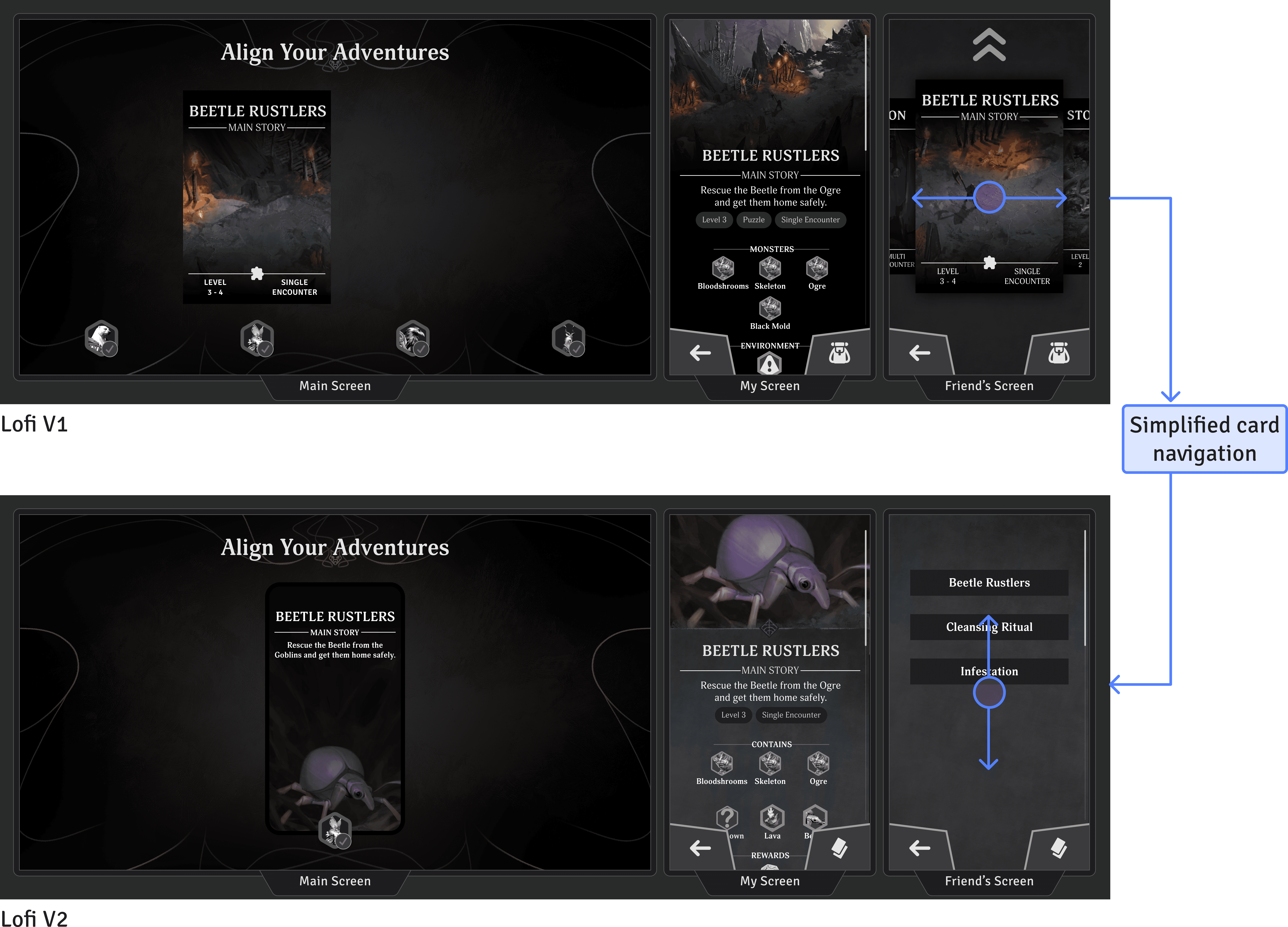
Through qualitative testing, leadership discussions, and pitch reviews, we confirmed this as a strong UX direction. However, we needed to reassess the production costs before moving forward.
Simplify Engineering
Card swiping wasn’t feasible at this stage without increasing production costs. Finding a way to preserve the intended design while minimizing engineering effort became key to improving efficiency and staying within scope.

Lessen 2D Art
In the initial pitch, the art assets were too large and costly to produce. I focused on simplifying the art requirements while maintaining the same visual narrative and clarity, ensuring players could still easily understand their destination and mission context.
Polish & Reskin
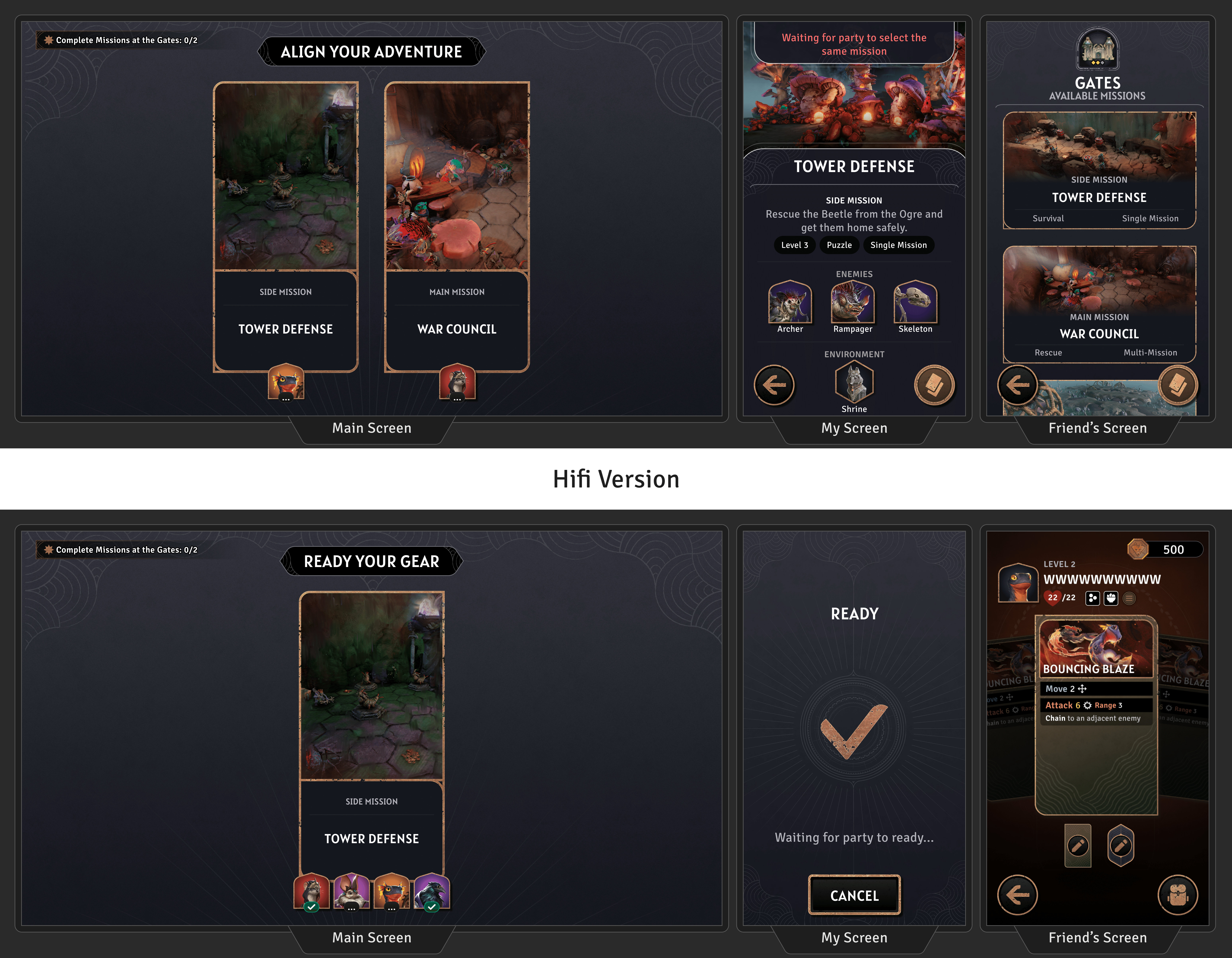
Using the visual pillars set by the UI Artist, and I created additional UI assets for this design. Then implemented these assets directly into Unity to ensure the screens met release-quality standards.
Solution
Solo vs Party
Engaging experiences that remain informative and clear for all players.
Accessible Information
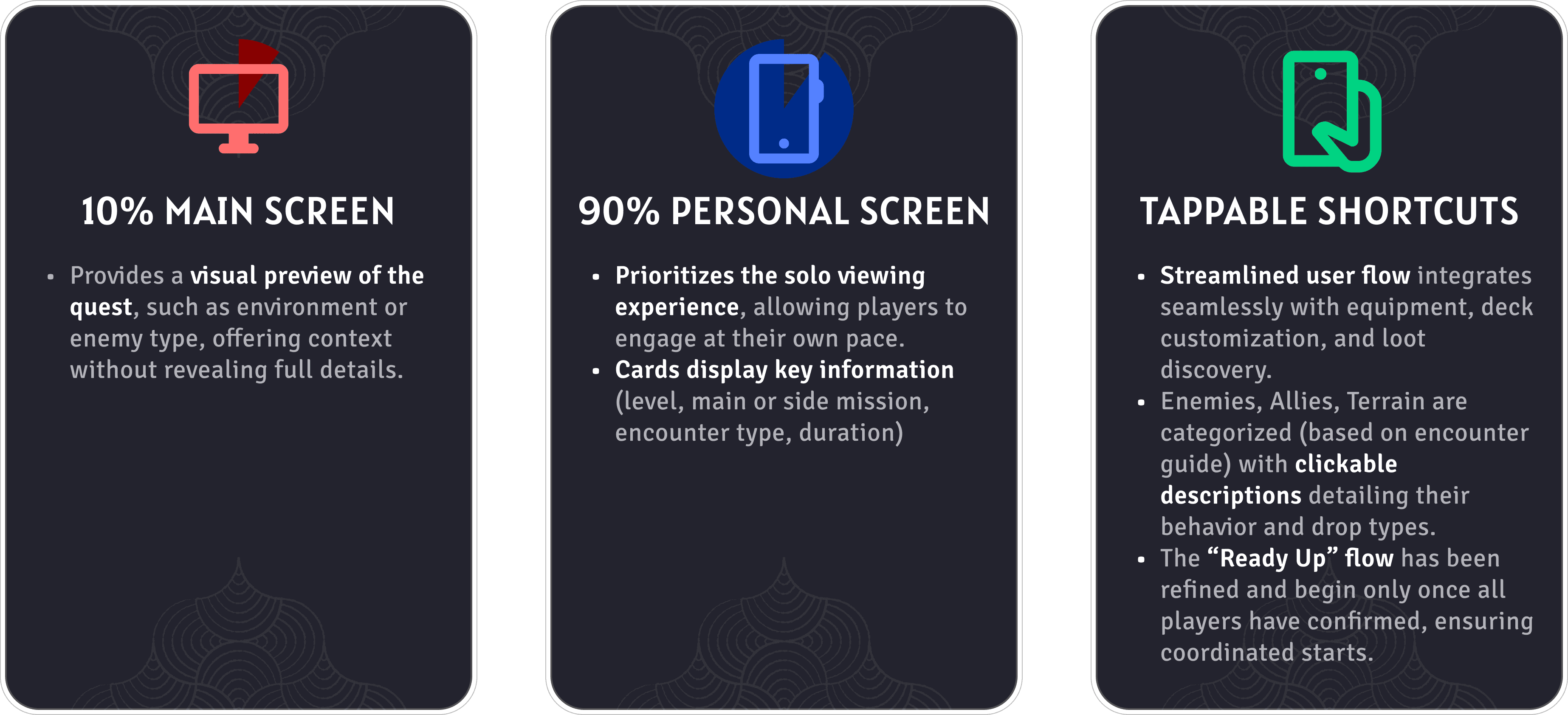
10% Main screen & 90% Personal screen
Align & Ready-Up
Players gather at the center of the gates to vote on their choices collectively.
Learnings
Good UX/UI can extend beyond the digital screen, positively influencing players' mood and energy.
This was the first major feature I pitched to stakeholders and leads.
Utilize UX/UI beyond the screen to help create a more positive environment and experience for players.
Found team discussions and collaboration essential for gathering feedback and refining ideas.
Learned to balance design goals with production costs and resource limitations.
Overall, I'm proud that the final design remains a reliable and effective solution for both designers and players.
See more